I’m struck by how easy it is to read things on Gemini. Not just skimming, but actual reading, like you would a book. Not everything written is great, but it’s usually worth reading all the same. Venturing out into the land of contemporary HTML is different, and it’s not a subtle difference.
I’ve written before about the plague of inline links on Wikipedia, and this is largely a continuation of that discourse looking at other design elements.
It’s an increasingly established truth that our attention span is somehow being dwindled, and to combat this there seems to exist a sort of unfortunate arms race to draw the reader’s attention to what is being written, accompanied with calls to write simpler texts with short sentences and catchphrases that can be absorbed even at the briefest of glances. Colors, too. And images, doesn’t matter how irrelevant. They gotta be there or people won’t look!
Maybe in part this is a cause of the problem it’s trying to solve. If you call attention to everything, you call attention to nothing; all while cluttering up the presentation with colors and doodads that actively impair reading specifically because they constantly attract the attention of the reader away from reading. It’s like having a conversation in a crowded and noisy bar: Of course you need to shout short sentences, that is no place for nuanced rhetoric.
It’s well known in the expressive crafts that the bigger your movements are, the smaller your capacity for nuance becomes. It seems all but forgotten that you can emphasise things in text without any use of colors or fonts. You can use abrupt sentences. You can use exclamation points! OR USE CAPS TOO!
You can isolate a key point to really give them that extra punch.
Most important of all: If you exercise restraint with these techniques, and reserve the attention grabbers to the parts where it really is merited, they they have a much bigger impact than if you use everything everywhere.
The fact that you often have ads or other distracting elements surrounding or indeed within the lines of text doesn’t help either, often specifically designed to draw the reader’s attention away from reading. What I wanted to show is that the ads aren’t the only problem even if they may be at the other end of the rope in this pointless tug-of-war for the reader’s attention.
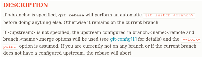
A screenshot form the documentation for git-rebase
The heading I don’t have a problem with even though it’s a different color, but I count eight different points of emphasis in those two paragraphs. Undoubtedly well-meaning, but it’s hard to do anything but skim text such as that. It’s especially unfortunate since rebase is one of those concepts that people really seem to struggle with when learning git.
The subject matter itself is hard to read too, even in the plainest of man page renderings, no amount of typography can help remedy git’s leaky abstractions (or lack of abstractions).
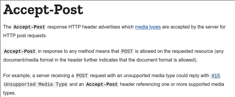
A screenshot from MDN’s documentation for Accept-Post
Again it has more points of emphasis than it has lines, and most of the things it emphasises would have been emphasised even without changes in color or font. Words like Accept-Post and HTTP do already stick out, because they are capitalized differently. The effect, when reading the text is skimming. The reader’s eyes are probably going to bounce between Accept-Post, HTTP, media types, Accept-Post, POST, POST, 415 Unsupported Media Type and finally Accept-Post; with zero comprehension of what those paragraphs actually conveyed.
Even though these examples are from technical writing, you see similar problems across most genres. In the cases the text itself is relatively free from calls to attention, it’s often surrounded in colorful design elements suggesting where to go next.
Our ability to focus probably hasn’t changed, what’s happened is a stylistic metamorphosis of what we are trying to read.
Referenced Texts
Referenced Webpages
- https://git-scm.com/docs/git-rebase
- https://developer.mozilla.org/en-US/docs/Web/HTTP/Headers/Accept-Post
Acknowledgements
Thanks idiomdrottning for pointing out the superfluity of some of my own internal references in a previous version of this text (sparse as they were).